Angie has worked as a hairstylist in the DFW metroplex for over 15 years. She has been self-employed for 10 of those years. Her utmost priority is to provide her guests with a comfortable, relaxing salon experience and to create the most beautiful hair for them. She prides herself on customer service and continues to educate herself to keep up with current trends.
Visual Design
Branding

Project Overview
Client: Angie Sierp, a DFW-based hairstylist and entrepreneur
Timeline: 6 weeks (2024)
My Role: Brand Designer
Tools: Sketching, Adobe Photoshop, Illustrator, Lightroom
The Brief
Create a new logo and identity system for a local business with limited, outdated branding.
The Design Approach
Researching: Understand the market, Angie's personal brand, and her target customers
Ideating: Sketch ideas for a logo that accurately represents Angie
Refining: Iterate on designs and narrow down using feedback from peers and mentors
Branding: Create guidelines to support and explain the logo
Integrating: Design marketing materials to seamlessly incorporate the logo into touchpoints

RESEARCHING
Meet Angie Sierp
Conducting consumer research
Angie Sierp has worked as a hairstylist in the DFW metroplex for over 15 years. She has been self-employed for 10 of those years. Her utmost priority is to provide her guests with a comfortable, relaxing salon experience and to create the most beautiful hair for them. She prides herself on customer service and continues to educate herself to keep up with current trends.
At the time, Angie did not have any strong branding to differentiate her from everyone else and really show what made her special.
Welcome to the Golden Halo Salon
Angie shares her salon space with her longtime friend and peer, Holly Wilson, and named it the Golden Halo Salon. They have some decor but no specific branding touchpoints in the salon other than the front plaque and business card.
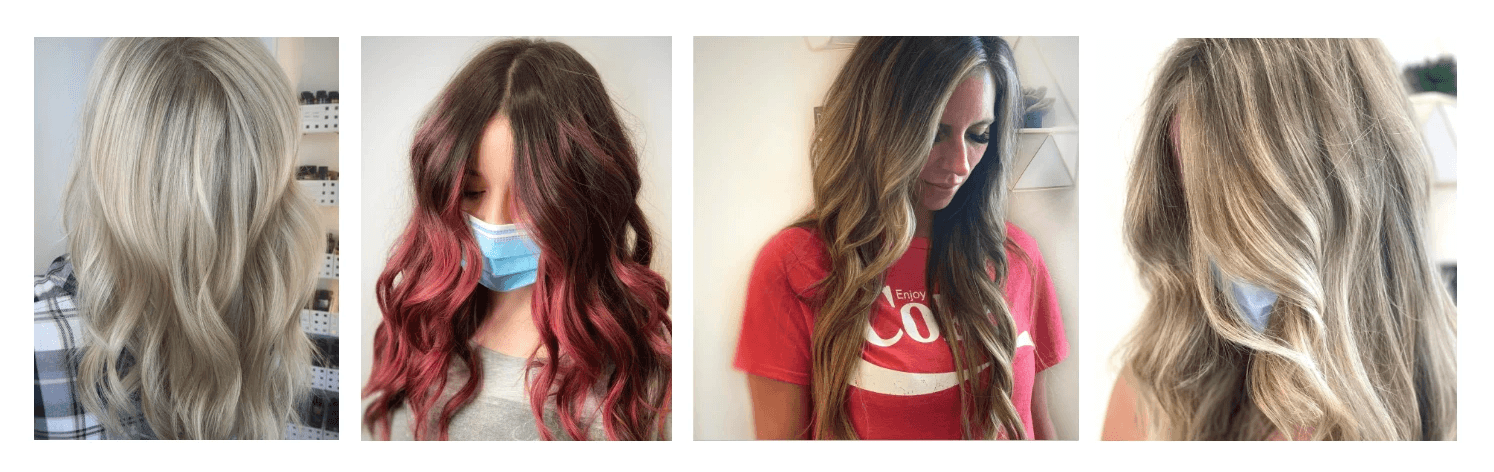
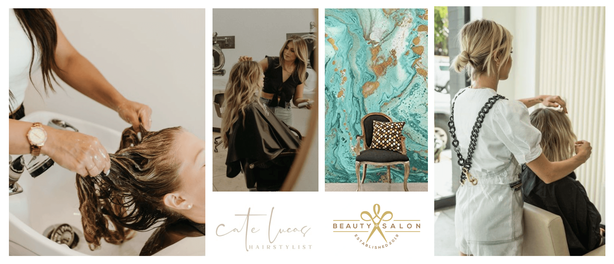
Current Photography Style
Angie's current pictures of her work show the stunning end result. However, these photos lack warmth and the woman behind the chair, Angie.
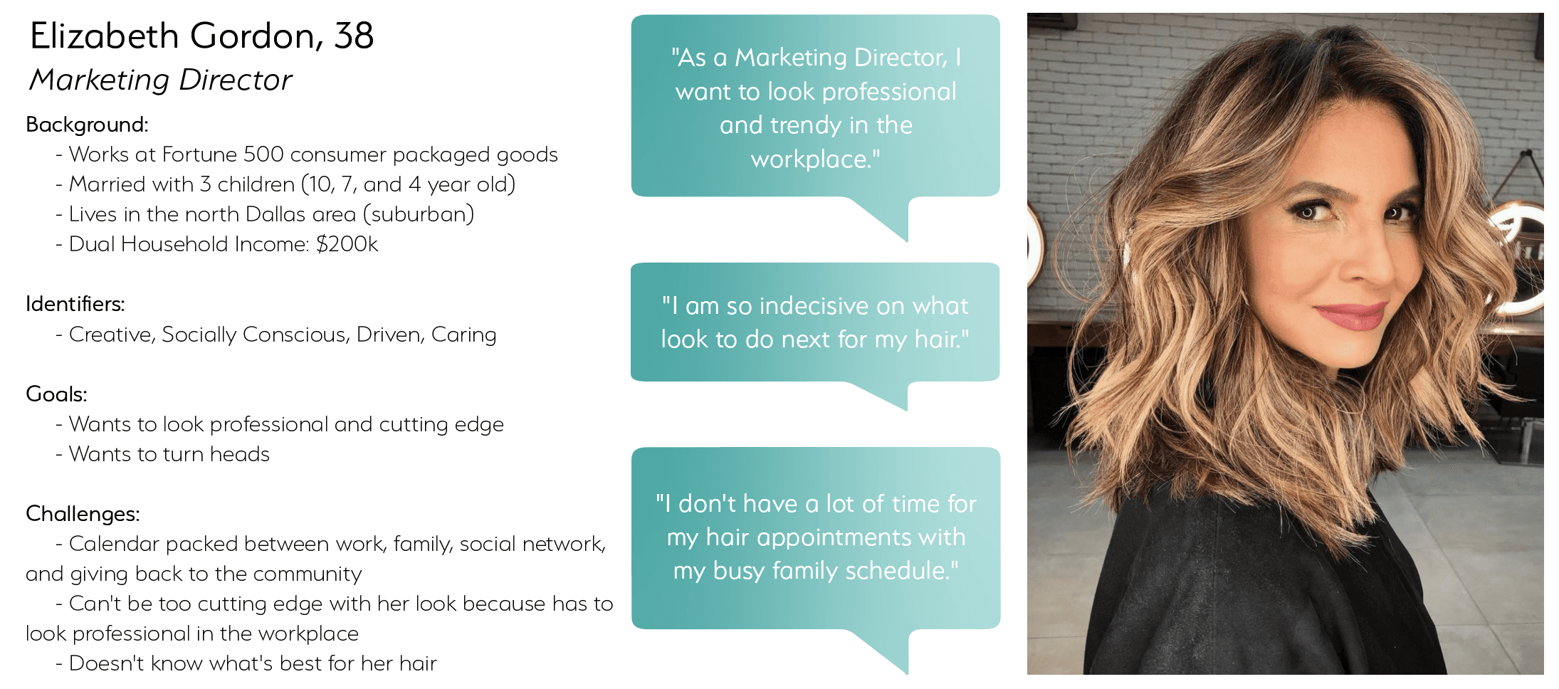
Buyer Persona
To understand who I am designing for, I needed to get into the mind of Angie's average customer. I need to clearly communicate what makes Angie stand out from other hair stylists in the area and why her customers choose her.
Mood Board
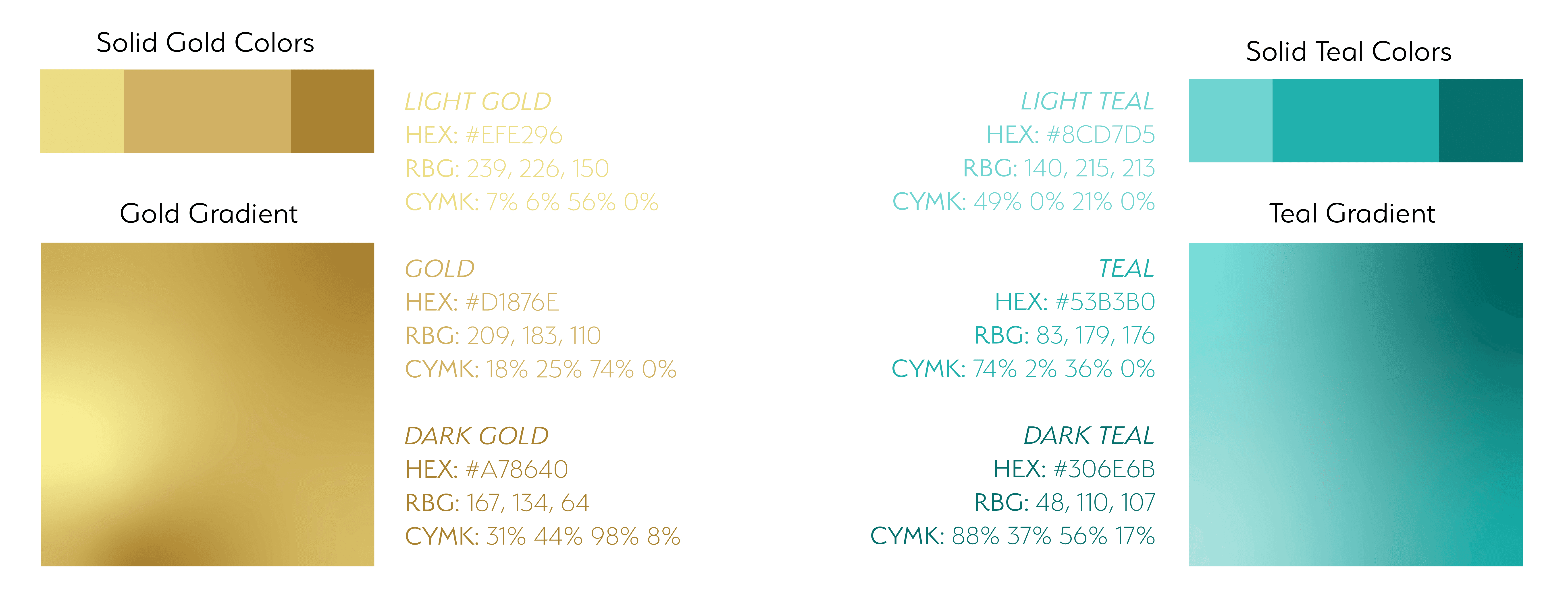
Angie informed me that her favorite colors were Tiffany blue and gold, which is why she hung up the marble print at the entrance to her salon. I wanted to take a classy avenue to represent her brand and clientele.
IDEATATING
Visual Exploration of the Possibilities
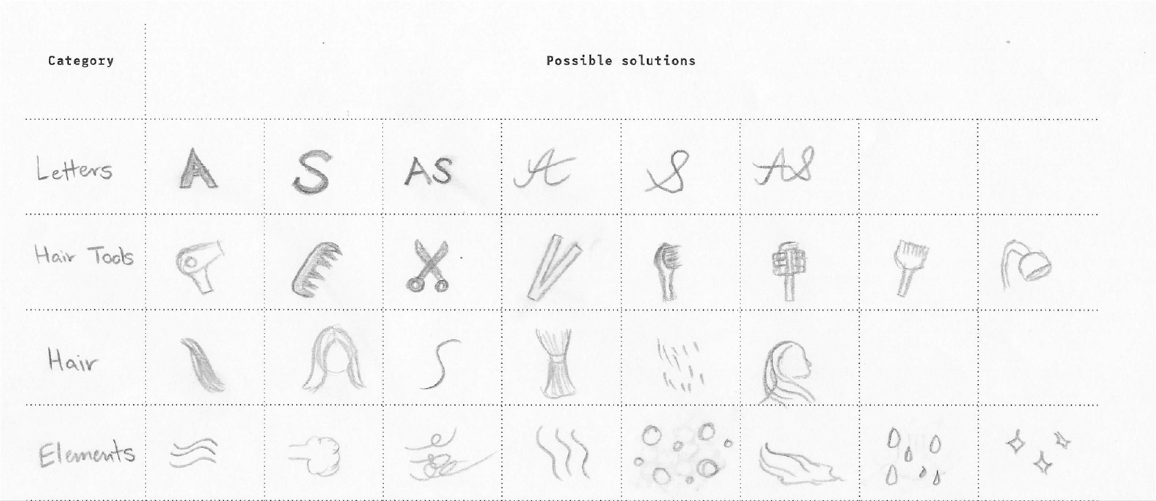
Breaking down the elements of the brand
I started with the basics, pencil and paper. I used a morphological matrix to conceptualize everything associated with Angie and a hair stylist. I chose the categories of letters, hair tools, hair, and washing elements to explore the possibilities.
Morphological Matrix
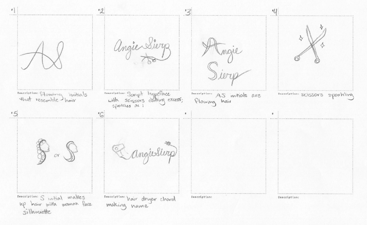
Sketches
I combined at least two solutions to create thumbnail sketches. Since this is a personal brand, I wanted to incorporate Angie's name into the logo. I found that I liked the flowing style to mimic hair.
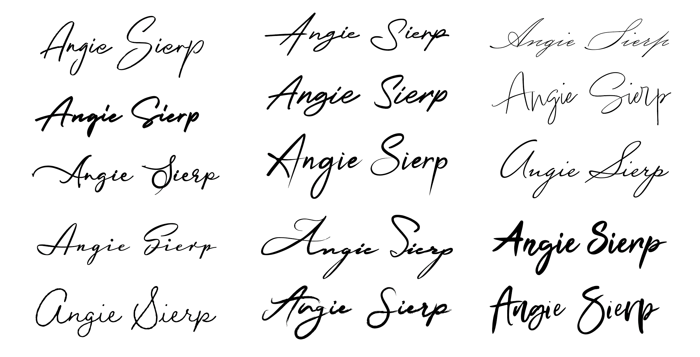
Type Exploration
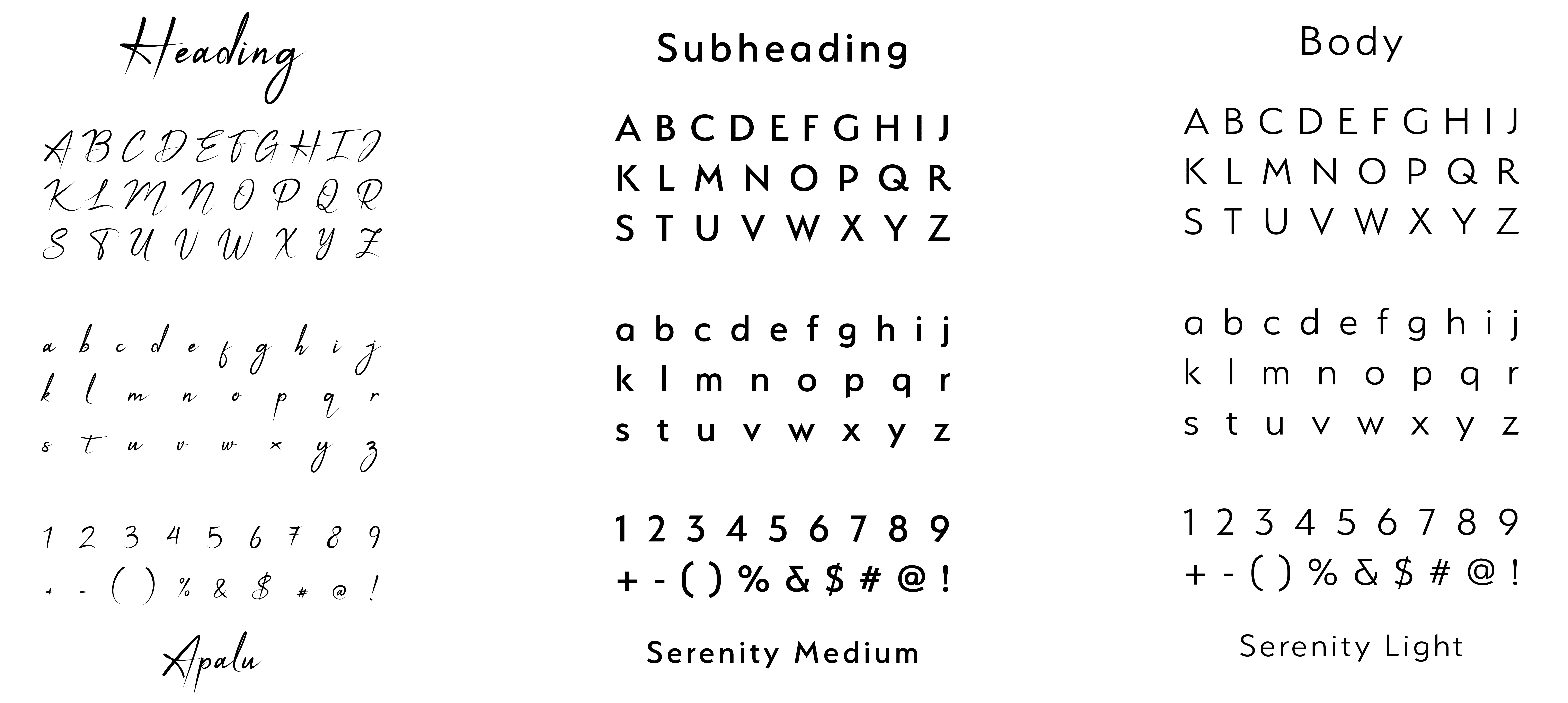
Moving to Illustrator, I found 15 potential type options to bring my idea to life. From here, the font in the middle really stood out to me and met the criteria of imitating hair while also being strong enough as a name.
REFINING
Feedback from My Client, Mentor, and Peers
Finalizing the best iteration
I took my two favorite fonts and started experimenting with incorporating hair-styling tools to create a logo. I found that one font was too thin in comparison to the heavy scissors. I switched to my second choice and found the balance to be more visually appealing. Still, the scissors felt disjointed from the font's style. I wanted to make the scissors from the letters to create a more cohesive look. From there, I refined the angle of the scissors.
Logo Exploration
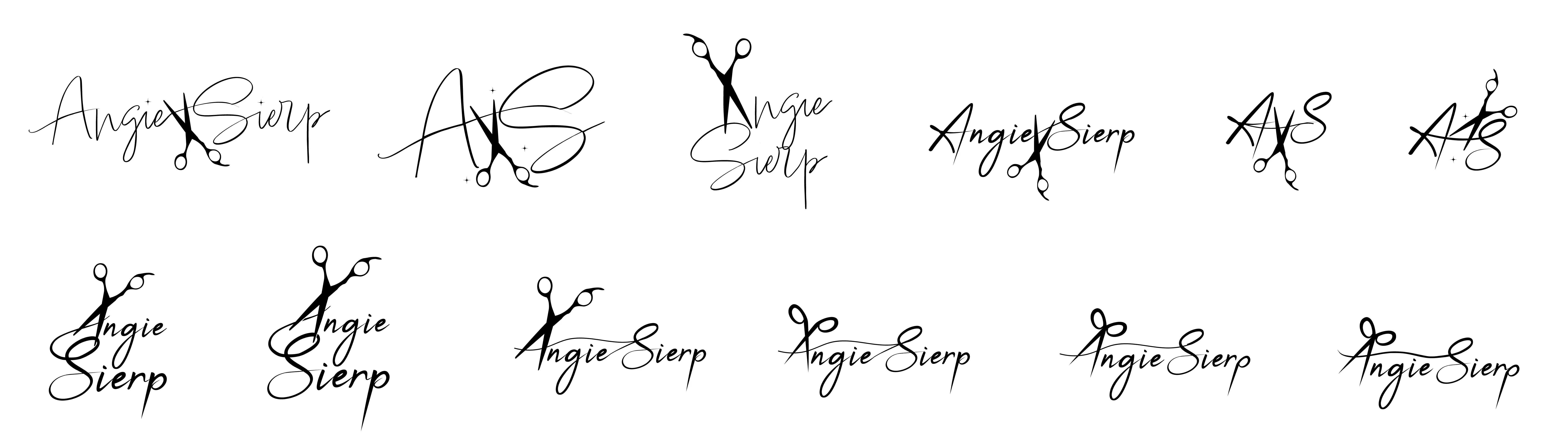
Initial Logo
I initially wanted to make the scissors gold to match the high-end aesthetic of gold tools. However, my peers and mentor pointed out that flipping the colors would better highlight Angie's blonde specialty.
BRANDING
Final logo and application
Introducing the new and improved brand of Angie Sierp
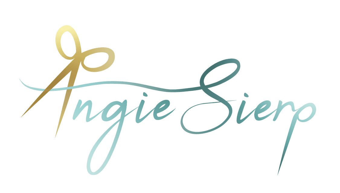
I created additional logos, identified misuse cases, and selected colors and typography to finalize the brand.
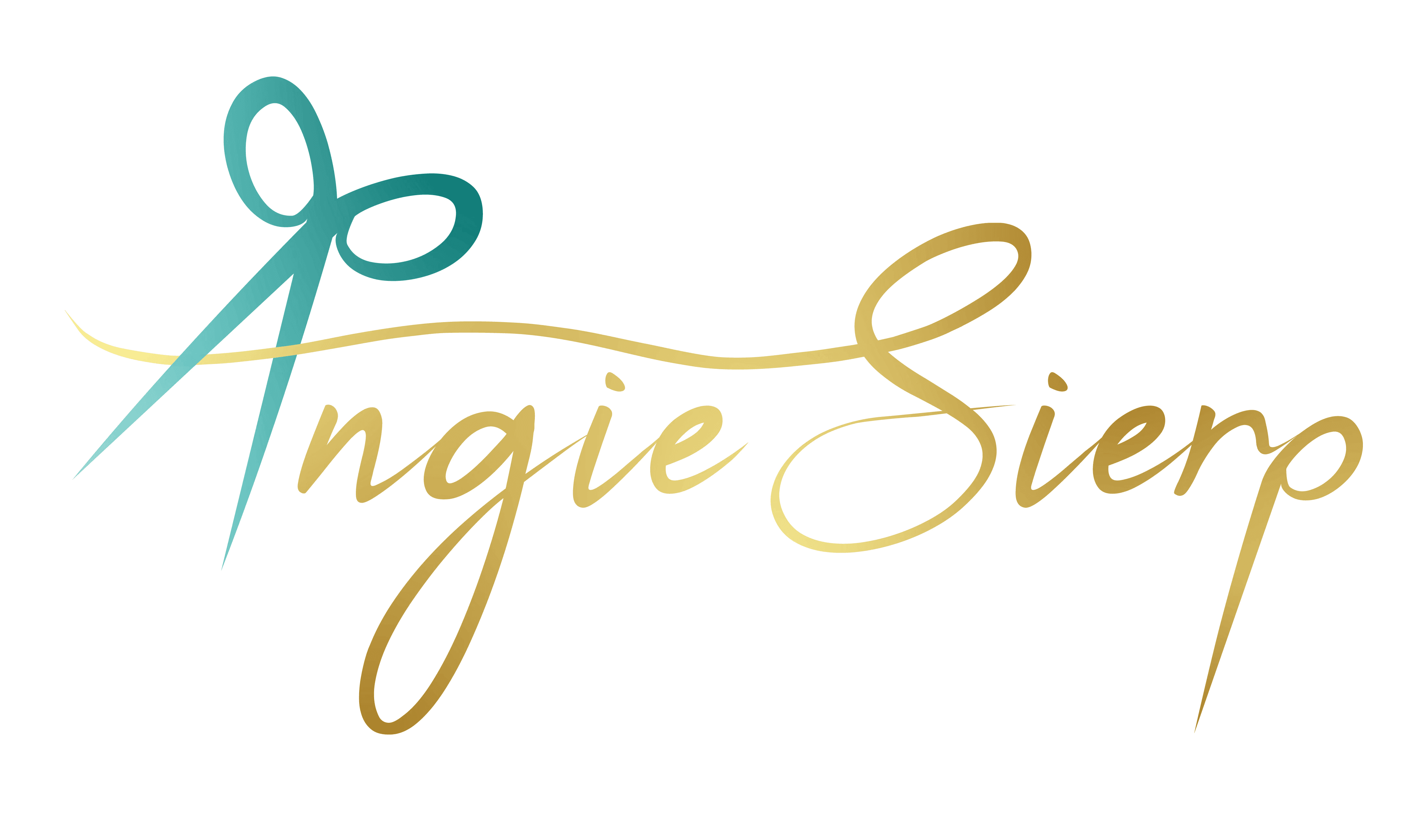
Color Logo
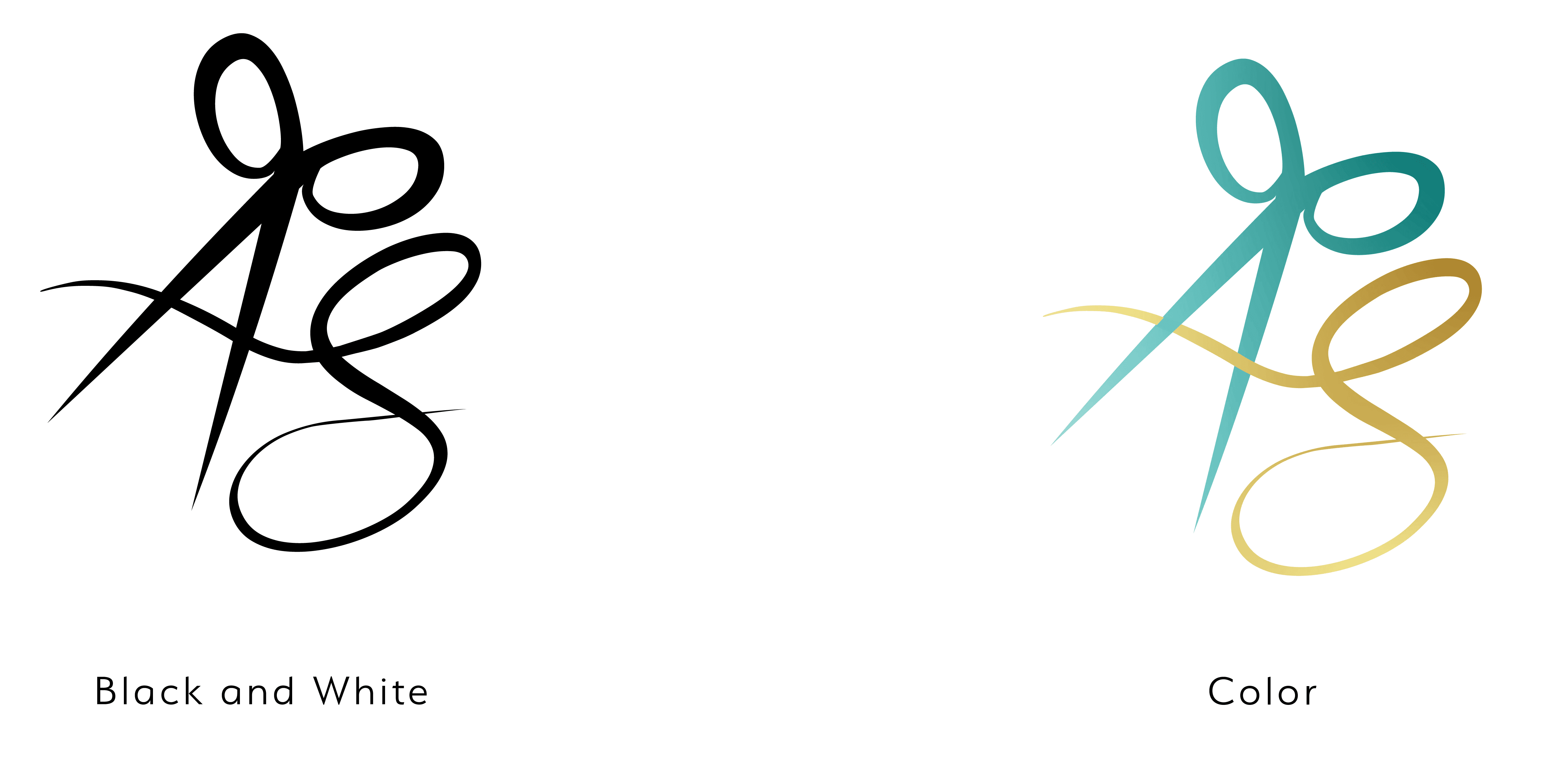
Alternate Logos
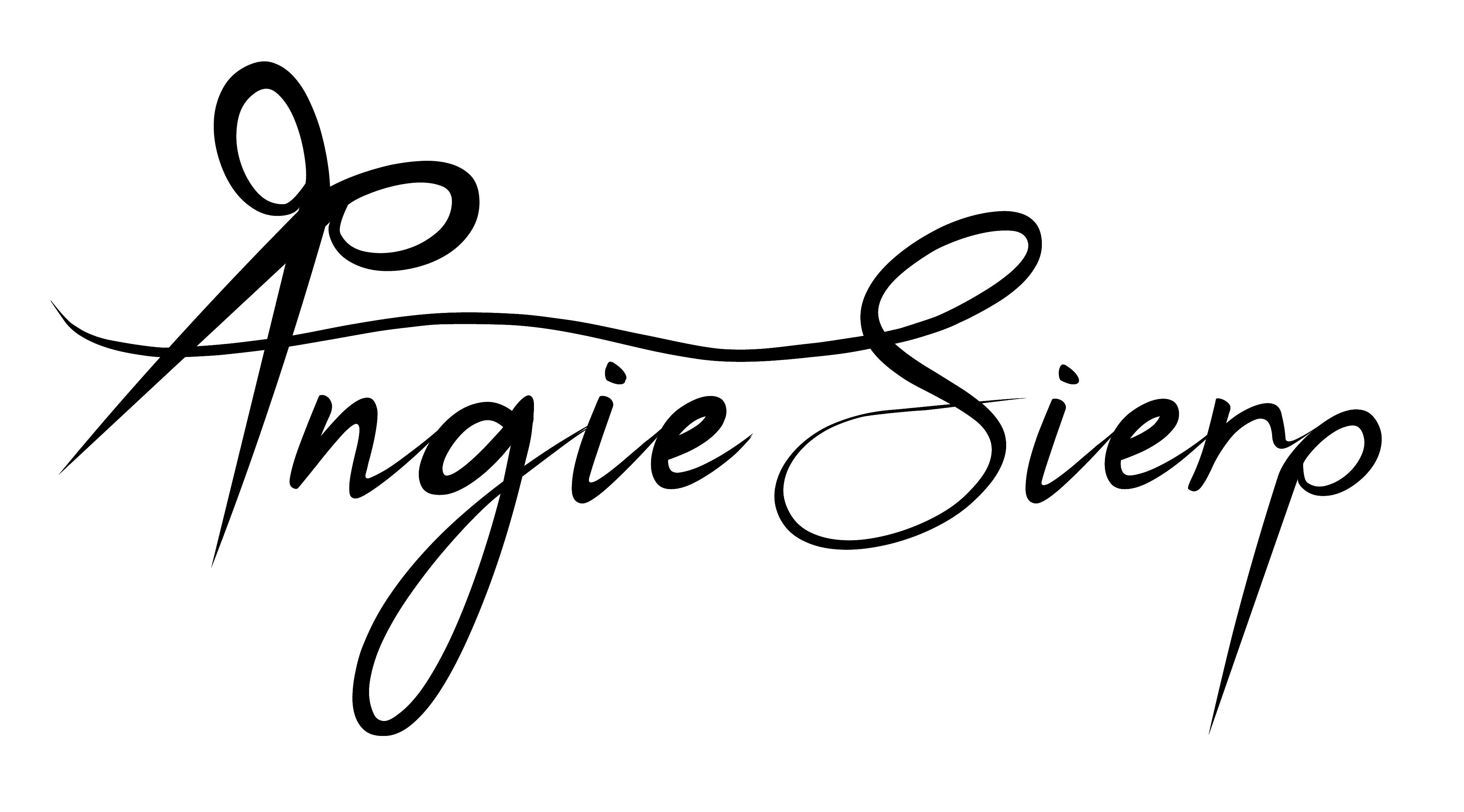
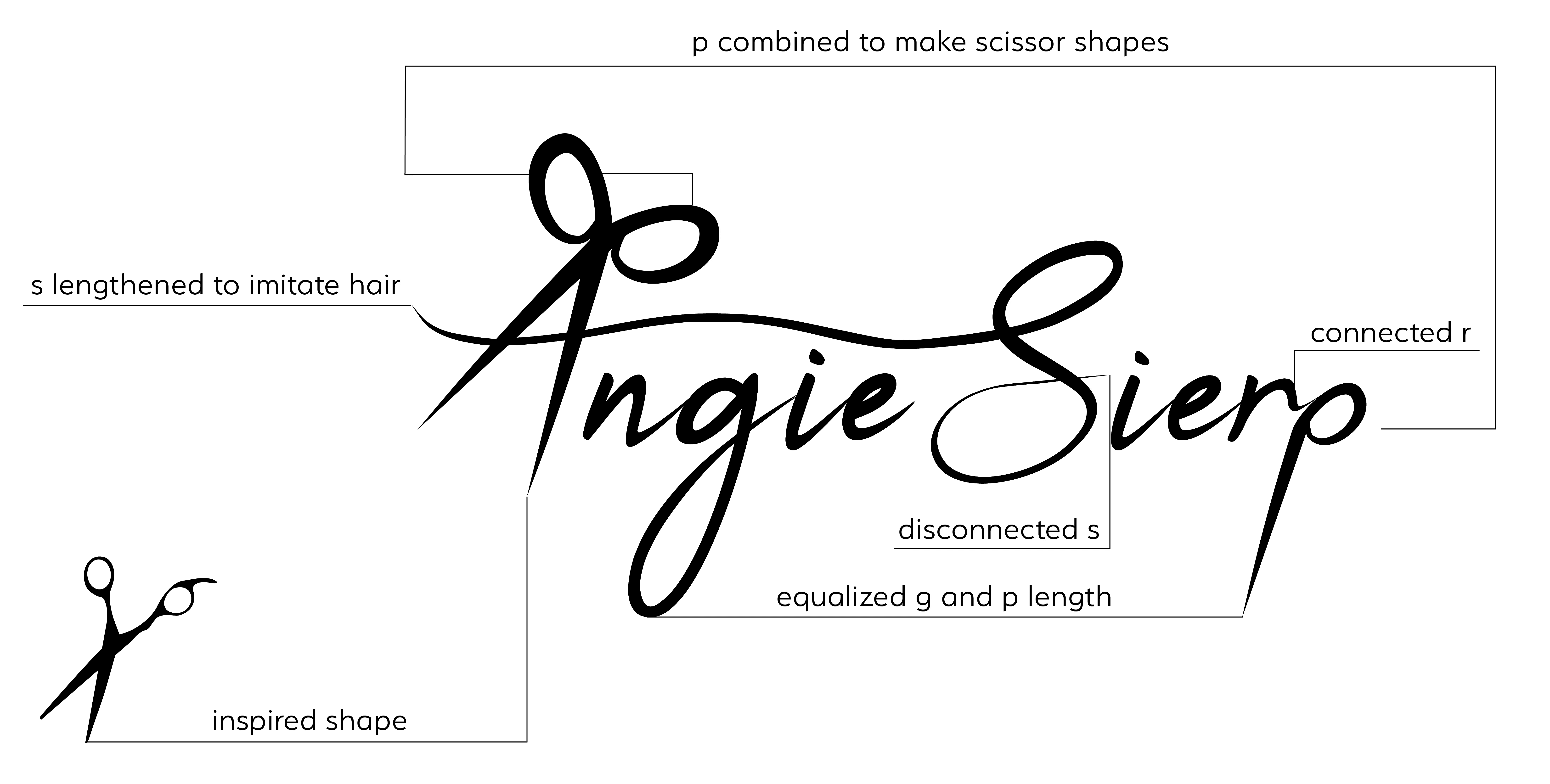
Logo Breakdown
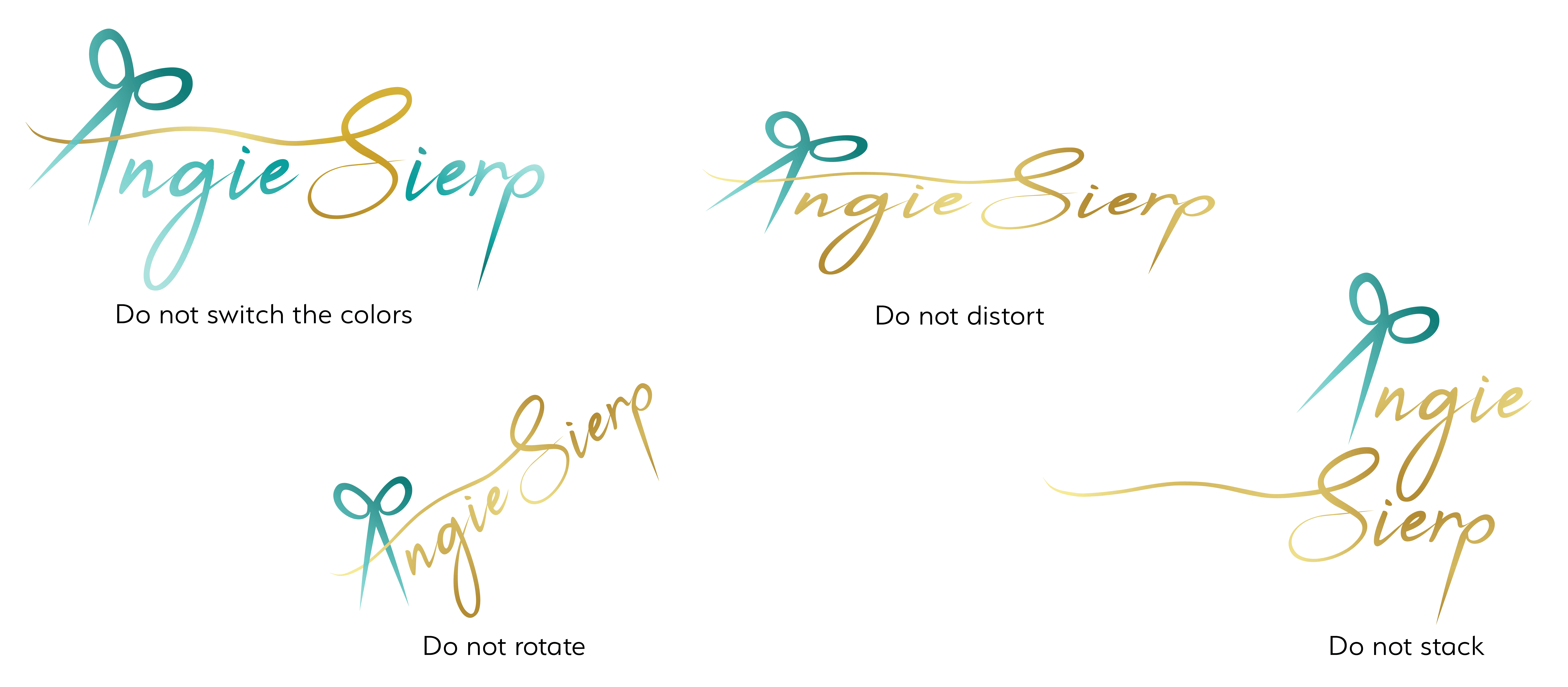
Logo Misuses
Color Palette
Typography
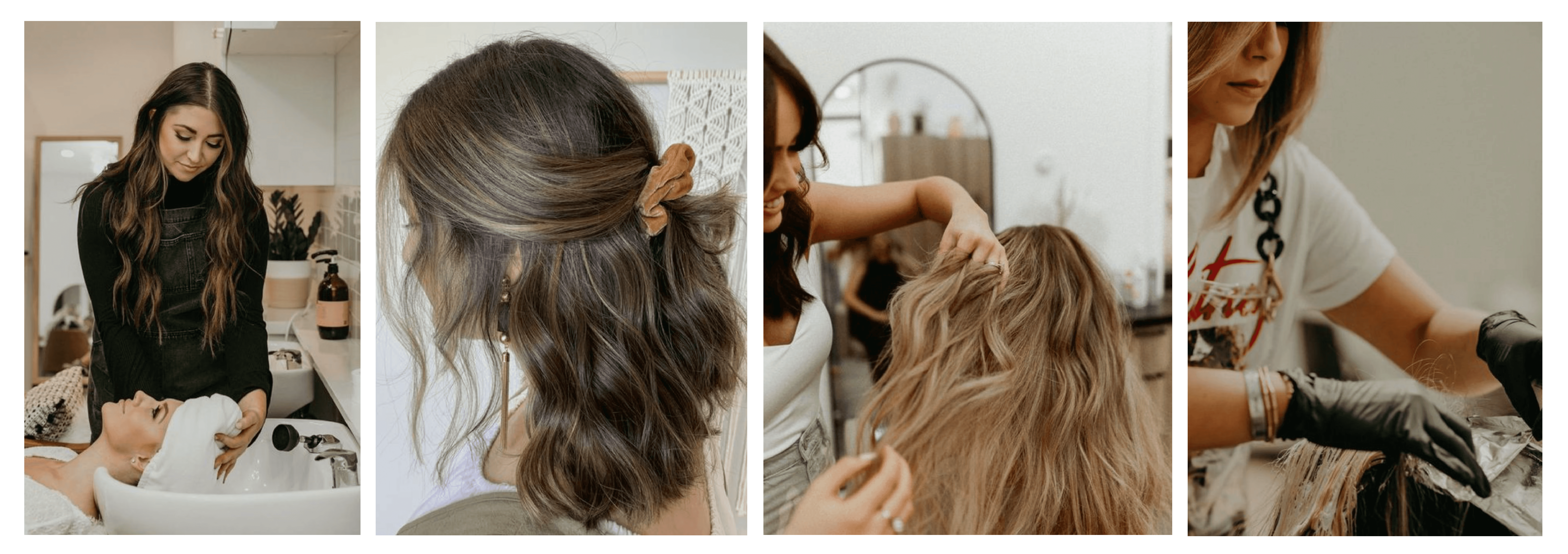
Photography
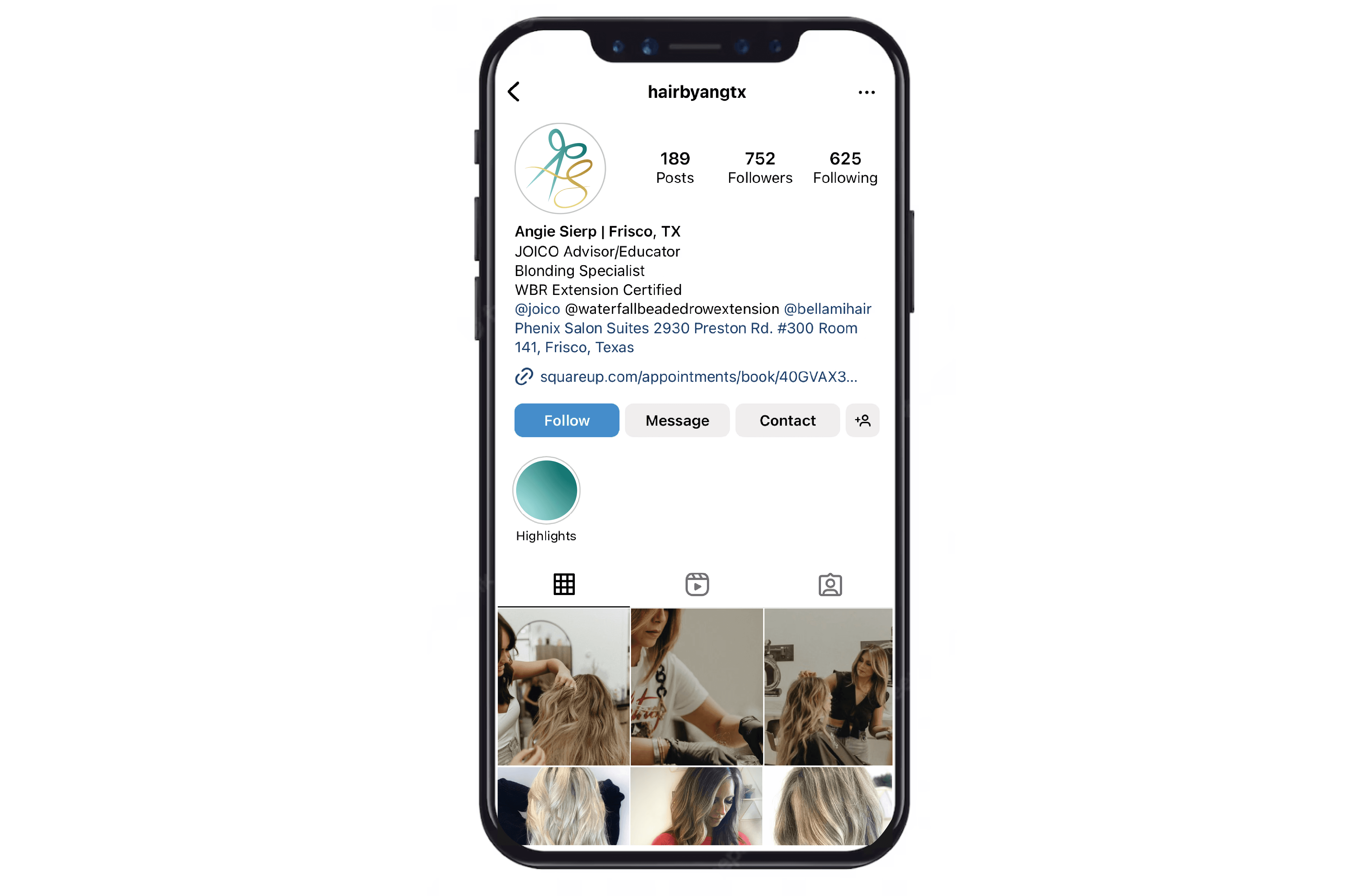
Photography should highlight both the customer and the stylist, Angie. The editing should be warm-toned to match the gold/teal color scheme and convey a welcoming vibe to potential customers. Posts should highlight each step of the process, showing Angie’s multifaceted skills and talents.
INTEGRATING
How the Brand Looks in Real Life
Branding in her existing space
I created mockups to show how Angie can use her new branding as marketing touchpoints.
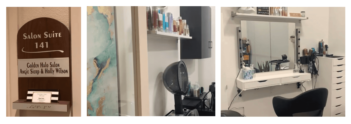
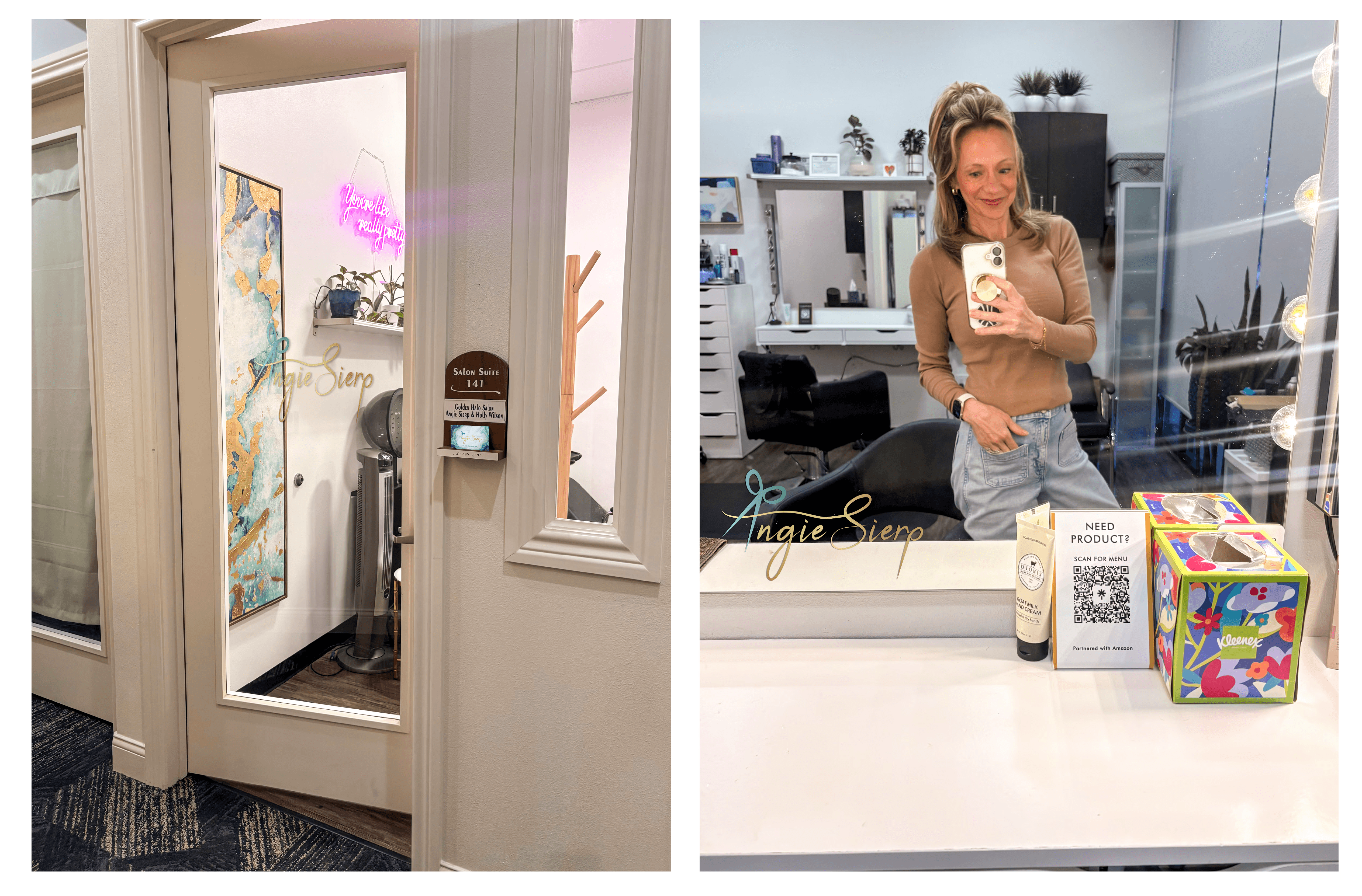
Salon
On her door, I recommend that Angie place her new and improved business cards in the holder and apply a window decal to the front door. Also, she should add the logo to her mirror so people can quickly recognize the hairstylist from one client's mirror selfie.
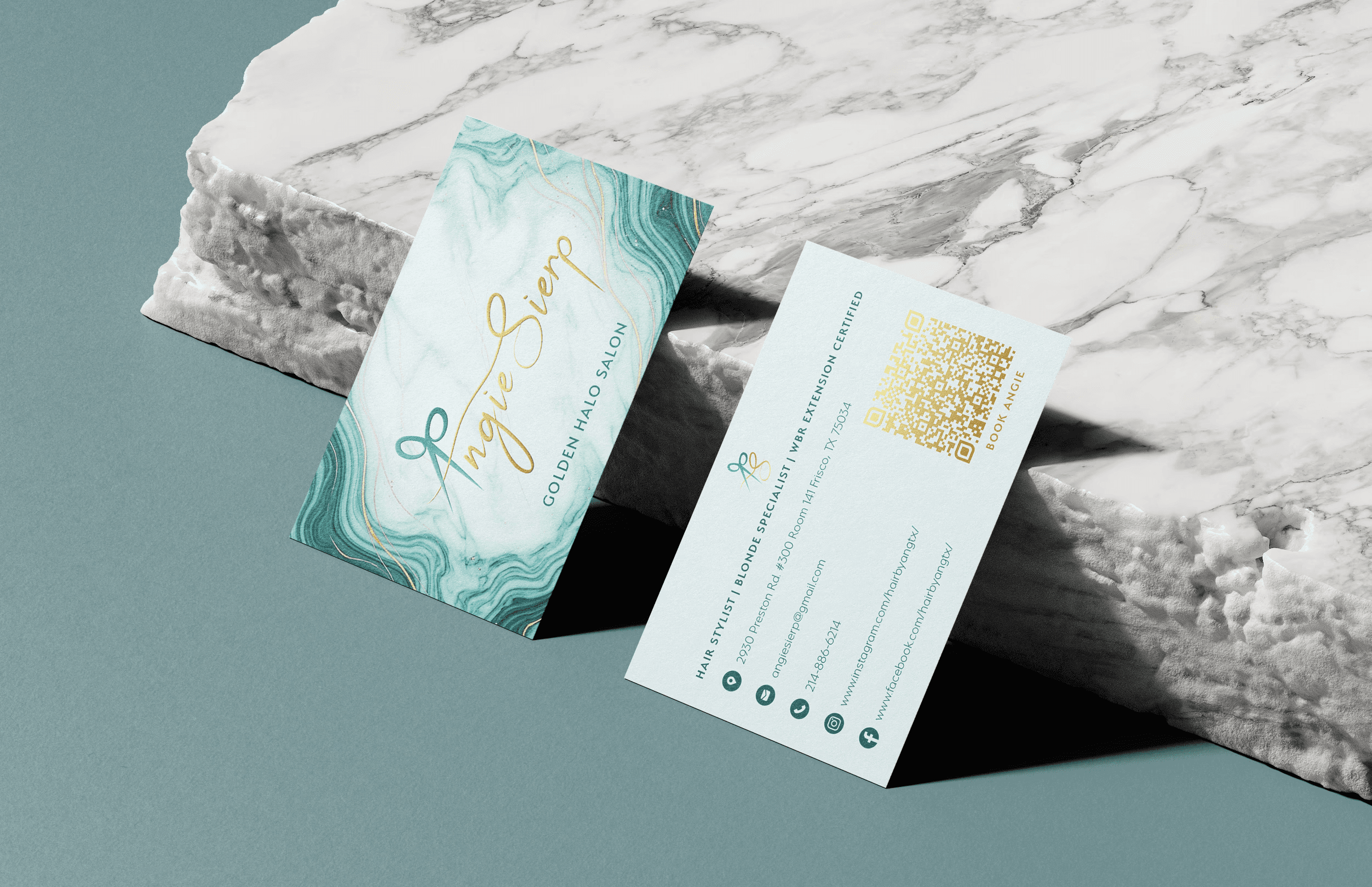
Business Card
I designed the business card with a marble-gradient background and gold streaks that mimic hair, framing the raised logo. On the back, I included all the information clients need from Angie, as well as a QR code linking to her booking website.
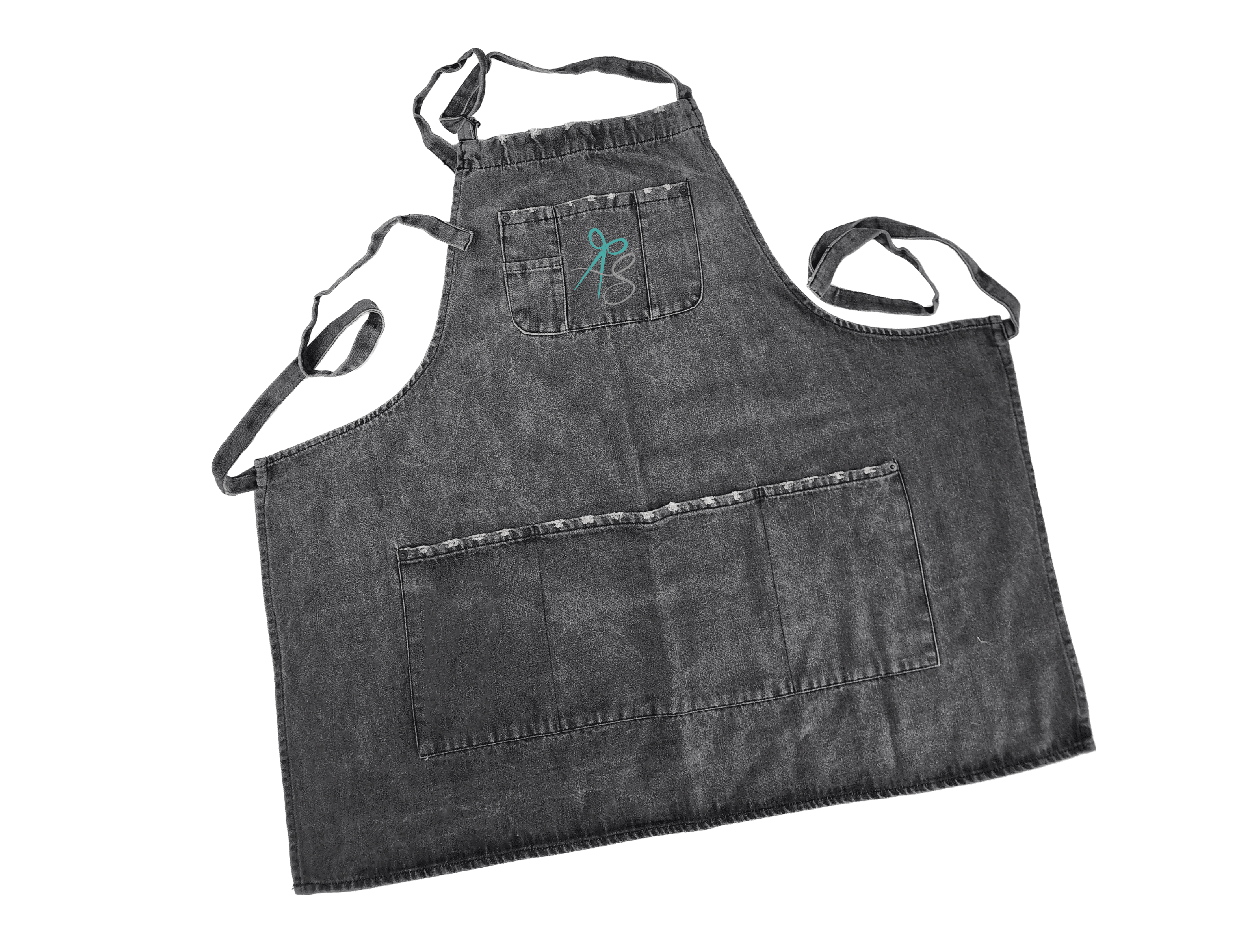
Apron
Angie always wears her acid-washed denim apron, so I wanted to incorporate her branding by embroidering the alternate logo on the front pocket to add a professional touch.
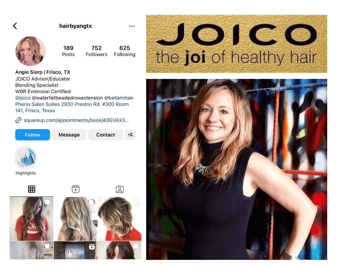
Instagram Profile
An example of including all my recommendations on her social media platforms.